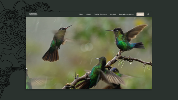
Regular Animal creates a new website for Odyssey Earth, based on the idea that users can learn while enjoying an adventure on their new site.Miami-based marketing agency Regular Animal, designs and implements a website for educational non-profit Odyssey Earth, which uses this visual portal to transport users to different video-learning adventures that would help them learn science in real-world settings.The design brief was to create a website that inspired audiences to immerse in an adventureanywhere when they learn with Odyssey Earth, explains creative director Ana Meira. “Our strategy was to entice and engage audiences with immersion, so they can fit in and feel like they are not only learning but living an adventure.”

“This idea evolved into a visual representation throughout the web’s identity,” Meira explains,uniting the website’s focus on immersive learning with the product’s UX. Regular Animal develops the website’s UX and UI as well as the visual identity. Starting from a dark shade of green as the main color—a choice that is not generally used in projects for such young audiences, Regular Animal develops a nature-focused color palette that gives Odyssey Earth a warm visual identity while providing a sense of discovery and exploration.Odyssey Earth also wanted to establish online authority for their educational content, improve organic search rankings, and convert web visitors into leads with a professional web design.The non-profit’s director, Richard Kern, believes in sharing value through his unique video content and because of that, the SEO strategy created by Regular Animal, revolves around working with his videos to make sure they rank well for the most searched keywords. This will help to establish Odyssey Earth as the thought leader as an educational content provider in South Florida. Regular Animal web design experts followed the best SEO practices in order to improve Odyssey Earth’s rankings in organic search. This implied extensive on-page SEO when rebuilding the Odyssey Earth website and wide-spread backlinking strategy.
Only one typeface is used throughout the site, Radio Canada. A bold modern high-contrast sans serif font that balances visual interest with restraint. The Radio-Canada font was created in 2017 by Montreal-based designer and typographer Charles Daoud, in collaboration with Coppers and Brasses and Alexandre Saumier Demers. It was designed specifically for CBC/Radio-Canada as a brand unifying information font for all the Public Broadcaster’s platforms. Fittingly for a Public Broadcaster, this is a peoples’ font and the humanistic style stands out with subtle curves and distinctive angles. Its x-height ensures excellent legibility and respects digital accessibility standards, making it very effective when used in continuous text.
In addition, Regular Animal also creates a series of topographic illustrations that emphasize the adventurous feel of the website and provide consistency and uniqueness to the design. Odyssey Earth’s new website is about inspiring people to go on an adventure anywhere they are—whether it’s a 10 minute video, or a full-length film, and everything in between.
About Regular Animal
Regular Animal is an independent creative agency that generates content and design across all platforms.We focus on just three things: strategy, content, and design. In our view, these three key disciplines are central to brand-building and brand development, and through the power of creative strategy, content,and design, we move organizations forward.
Media Contact
Company Name: Regular Animal
Contact Person: Ana Meira
Email: Send Email
Country: United States
Website: https://regularanimal.com/
